
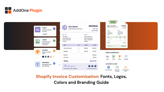
An invoice is one of the few pieces of content every single customer opens and reads carefully, since it involves money. A generic, unbranded PDF wastes that attention entirely. This guide covers how to properly customize a Shopify invoice template with your logo, colors, and fonts, without needing to write code, and how to keep that branding consistent across every document type a customer might receive from you over the life of the relationship.
Why Generic Invoices Cost You Trust
A default, unbranded invoice looks like it could have come from any store, which does nothing to reinforce the purchase decision a customer just made or the relationship you are trying to build with them over time. A branded invoice, by contrast, reads as an intentional, professional touchpoint, the same way a well-designed shipping box or a handwritten thank-you card does, and it costs almost nothing extra to produce once the template itself is set up correctly from the start.
This matters more for B2B buyers than most merchants assume. A wholesale account receiving a generic invoice week after week quietly absorbs a small, cumulative signal that your operation is less established than a competitor sending polished, consistent documentation, even if your product and pricing are genuinely better on every measurable dimension that actually matters to them.
It is worth thinking about branding consistency the same way you think about a physical storefront. A retail buyer walking into a well-organized, clearly branded shop forms a different impression than one walking into a space that feels thrown together, even before they have looked at a single product. An invoice is your digital equivalent of that first impression, arriving at a moment when the customer is paying particularly close attention.
The cost of getting this right is genuinely low compared to most other branding investments a store makes. Where a redesigned storefront or a new packaging line requires real budget and lead time, invoice branding is largely a one-time template setup that then applies automatically to every document going forward without any ongoing cost per order.
Uploading Your Logo the Right Way
Logo placement is the single highest-impact branding change you can make to a document customers actually read from top to bottom, unlike most marketing emails that get skimmed at best or ignored entirely.
Resolution and Placement Tips
Use a high-resolution PNG with a transparent background so it renders cleanly against any template background color, and place it in the header, either top-left or top-right, where it will be the first thing a reader sees the moment the document opens on their screen. A blurry or pixelated logo undermines the professionalism you are trying to add in the first place, and it is worth exporting a dedicated version specifically for this use case rather than pulling whatever low-resolution file happens to be sitting in an old marketing folder from years ago.
Sizing matters almost as much as resolution. A logo that is too large crowds out the header information a buyer actually needs, order number, date, and business details, while one that is too small can look like an afterthought rather than a deliberate brand element worth noticing.
Setting Brand Colors Across Every Document
Consistent color use across your documents reinforces brand recognition the same way consistent color use across your storefront does, and it is one of the fastest ways to make an otherwise plain document feel deliberately designed rather than generated from a default template nobody bothered to customize.
Headers, Totals, and Accent Lines
Apply your brand’s accent color to section headers, the total amount due, and any dividing lines between sections, while keeping body text in a neutral, readable color that does not strain on-screen or printed legibility. Avoid using your brand color for large background fills, which can make text harder to read and waste ink if the document gets printed by the customer or by your own warehouse team.
A useful approach is to reserve your boldest brand color for exactly one or two elements, the total due and perhaps the header bar, rather than spreading it across the entire document. This keeps the eye drawn to the parts of the invoice that matter most while still making the branding unmistakable at a glance.
Adding Custom Fonts Without Code
Most invoicing apps restrict you to a handful of system fonts unless you are comfortable editing CSS directly, which shuts out most non-technical teams from real typography control over a document that represents their brand to every single customer who receives one.
Using Google Fonts in Your Template
A drag-and-drop template editor that supports Google Fonts lets you select the same typeface used across your website and marketing materials, rather than settling for whatever default font the app ships with out of the box. This keeps the invoice visually consistent with every other piece of branded content a customer sees, from your homepage to your email receipts to the packing slip inside the box, reinforcing the same visual identity at every single touchpoint rather than just the ones a marketing team typically thinks to design carefully.
Font choice also affects readability in ways that are easy to overlook when picking purely for aesthetics. A decorative display font that looks striking as a website headline can become genuinely hard to read at the smaller sizes used for line items and totals on an invoice, so it is worth reserving a distinctive brand font for headers only and pairing it with a simple, highly legible font for the body content and numbers.
Matching Templates Across Invoices, Packing Slips, and Receipts
A customer who receives a beautifully branded invoice and then an unbranded, mismatched packing slip a few days later notices the inconsistency, even if they cannot articulate exactly what feels off about the experience as a whole.
Keeping a Consistent Look Across Document Types
Set your logo, colors, and fonts once and apply that same design system across every document type, invoices, packing slips, receipts, credit notes, so the entire order experience feels like it came from one cohesive brand rather than three different tools stitched together after the fact. Our guide on packing slip templates specifically covers that document type in more depth, including how it should relate visually to the invoice a customer receives in the same order.
Consistency across document types also simplifies your own internal workflow. Once a single design system is set, adding a new document type, a proforma invoice for a new B2B account, for example, is a matter of applying the existing branding rather than starting the design process over from scratch each time a new use case comes up.
This same consistency pays off when a new team member joins and needs to understand how the brand should look across customer-facing documents. A single, well-documented design system is far easier to hand off and maintain than a set of loosely related templates each built independently at different points in the store’s history.
Common Branding Mistakes to Avoid
A few mistakes show up repeatedly across stores customizing their invoice templates for the first time, and most of them are easy to catch with a short review before a template goes live.
Low-Resolution Logos and Illegible Color Contrast
Uploading a low-resolution logo pulled from a website favicon instead of a proper source file is the most common mistake, followed closely by choosing text colors that fail contrast against the background, making totals or terms difficult to read at a glance on both screen and paper. Test your template by actually printing it and viewing it on a phone screen before finalizing it, since issues that are invisible on a large desktop monitor often become obvious the moment the same document is viewed at a smaller size or under different lighting conditions.
A third common mistake worth flagging is inconsistent spacing and alignment left over from a default template that was only partially customized. A logo added on top of an otherwise untouched layout often sits awkwardly against margins and text blocks that were never adjusted to accommodate it, producing a result that looks unfinished even though the individual branding elements are technically all present.
Branding does not stop at your storefront. InvoiceForge’s drag-and-drop editor lets you apply your logo, colors, and fonts across every document type, no code required, so the entire post-purchase experience matches the rest of your brand from the moment a customer places an order through to the paperwork that follows it.